User Transition
The Advisory Board Co.
Sr UX Designer
UX design, UI design, prototyping, user testing
Mar 2015 - Apr 2015
In the spring of 2015 the users of a legacy version of Crimson Medical Referrals in the state of Arizona had to transition into using the new redesigned version of the application. A multiplicity of technical complexities and a lack of development bandwidth made this a fairly complex problem with a potential for a usability disaster. My task was to design the transition workflow within the two applications. My first step was to connect with the delivery teams and design a synchronized online and offline strategy for user communication. We created a continuous experience across the two applications including: communication banners, independent information site, printed materials and even gifts. We designed a character – Maxine the cat, to assist with patient engagement and to be a user-centered brand for the new product. In the day of the transition I was personally in Arizona, visiting over 10 medical practices across the state. We followed the transition with a survey in order to qualitatively measure our success. The transition was successful and soon after we saw an increase in utilization across the state.
This was the first time in the development of the application when marketing and communication was entirely centered on our users and not on the buyers of the application. The success of a collaborative approach between User Experience and the Delivery and Services departments inspired me to form the User Engagement Initiative.
Being a unique one off project, we wanted to move away from the corporate branding and create a more user centered communication materials. To better connect with our users we introduced a character – Maxine.
Users of Crimson Medical Referrals with Maxine t-shirts on the day of the transition. Maxine was a character designed for the occasion. (photo: James Sauerbaum)
I designed a custom information site that contained detailed outline of the time-line and scope of the transition.
Dedicated Information Website
Communication banners informed the legacy users of the transition.
There were some major feature changes in the new application, so I designed some simple and clear on-boarding instructions to greet the users with.
During my on-site observation I saw the majority of users seamlessly continuing with their tasks after going through the on-boarding process.
On-boarding instructions introduced the changes in the new application.
We used Maxine as a way to tie all forms of communication into a continuous experience. The character linked various interruptions into a single issue and reduced user anxiety.
One of a few communication messages.
I conducted a survey in order to evaluate not only the transition in itself, but some of our more experimental approaches like Maxine.
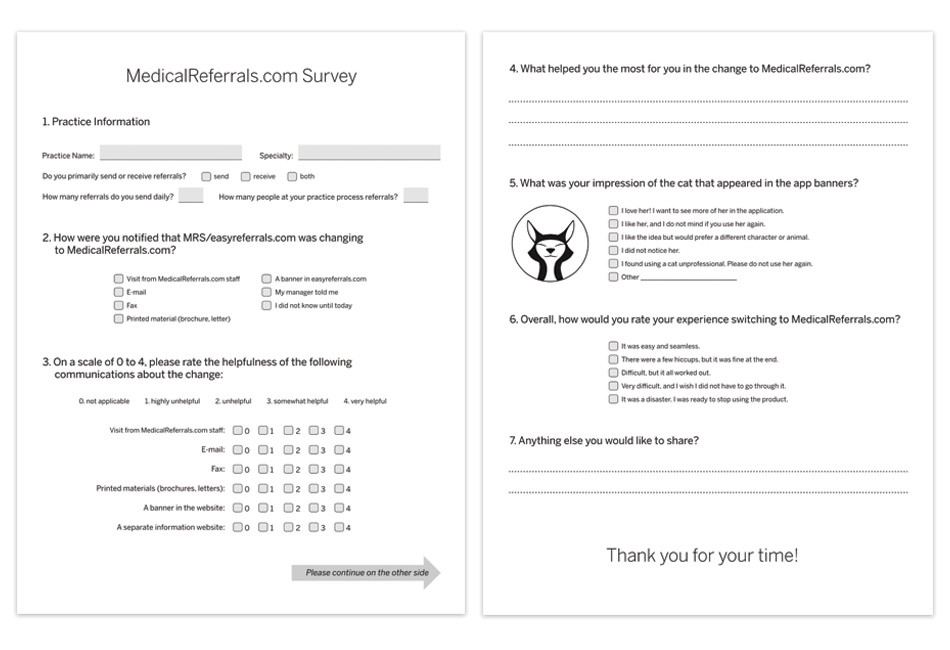
Users were asked to fill a survey after the transition to collect feedback.
At the end, both the reception of the new software and the experience of the transition was very positively received and opened possibilities for a more creative and experimental approach to building user engagement.