
Designing for the Medical Office
The Advisory Board Co.
Lead UX Designer
UX design, UI design, prototyping, user testing, basic foundational research
Jan 2014 - Aug 2016
The Setting: No Patience for Technology
The Medical industry has a complex relationship with technology. On the executive side, contemporary analytics software allows hospital executives to discover growth opportunities, manage large networks and lower care cost. At the same time on the care side, physicians and medical staff are often forced to change their workflow to accommodate the utilization of ineffective EHRs, struggle with lack of data integration, and rely on outdated hardware. The introduction of new software is always received with great skepticism and mistrust.
This is the environment within which we had to develop and introduce our product. The product had to be highly usable and its benefits visible from the very first glance at the UI. However, the incredible willingness of the users to provide quality feedback and assistance helped me meet those expectations.
Keeping Track of Complex Workflows
One of the biggest challenges in designing the application came from the great complexity and diversity of existing processes that the software had to accommodate. If a workflow scenario was omitted or missed the software could become useless for an entire segment of our users. Using workflow diagrams became one of my most powerful design tools, which ensured a clear communication within the development team and with clients.
User Interface Solutions
Our final goal was to emerge from all this complexity with simple, clear and intuitive interface. We have accommodated the user needs through two key interfaces: the referral dashboard that allowed users to manage their referrals (think Kanban board) and the referral form/detail - a document that contained information and tracked the status of individual patients (think Jira ticket). Both had to be optimized for both power users and low utilization users.
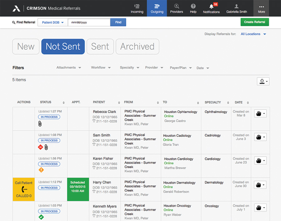
High utilization dashboard - The dashboard was the central part of the application. It simultaneously served the purpose of task management, status tracking and collaboration and communication tool.
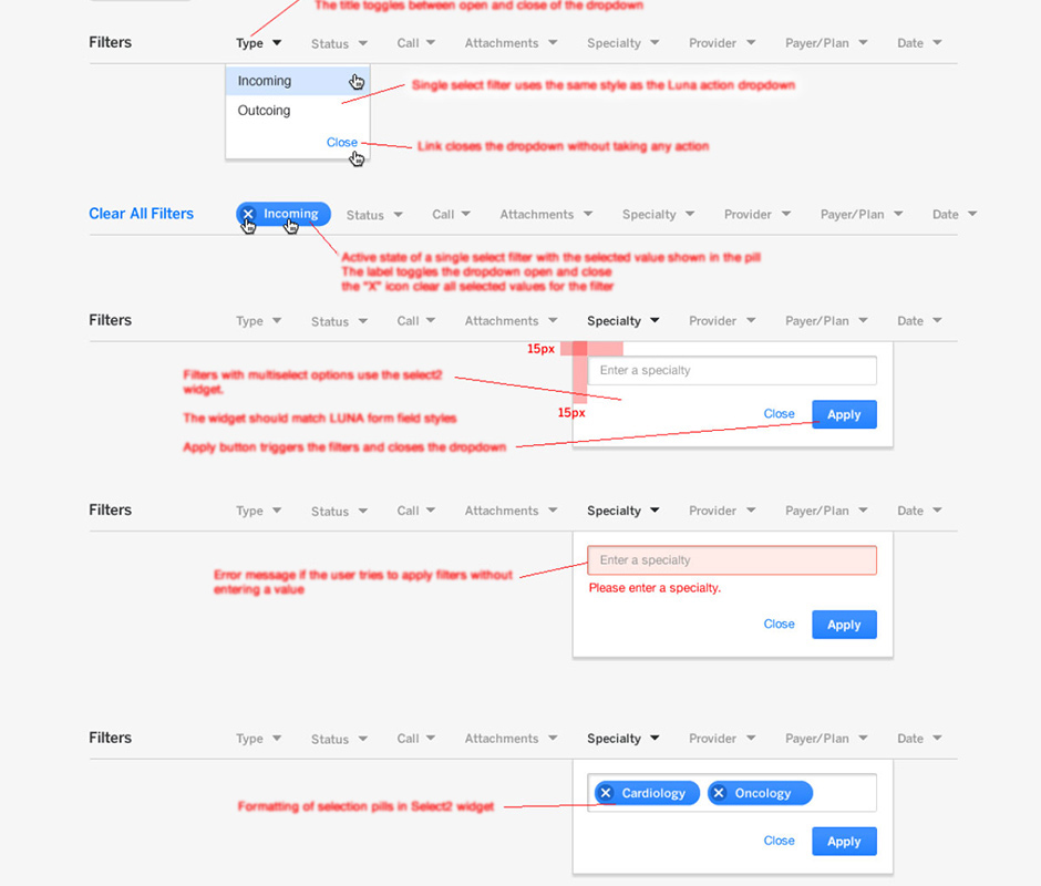
Custom micro-interactions - There are a number of custom micro-interactions that were designed. The Dashboard Filter was a design that I have extensively tested with a HTML and JavaScript prototype I have made. Once released it was extremely well received by users.
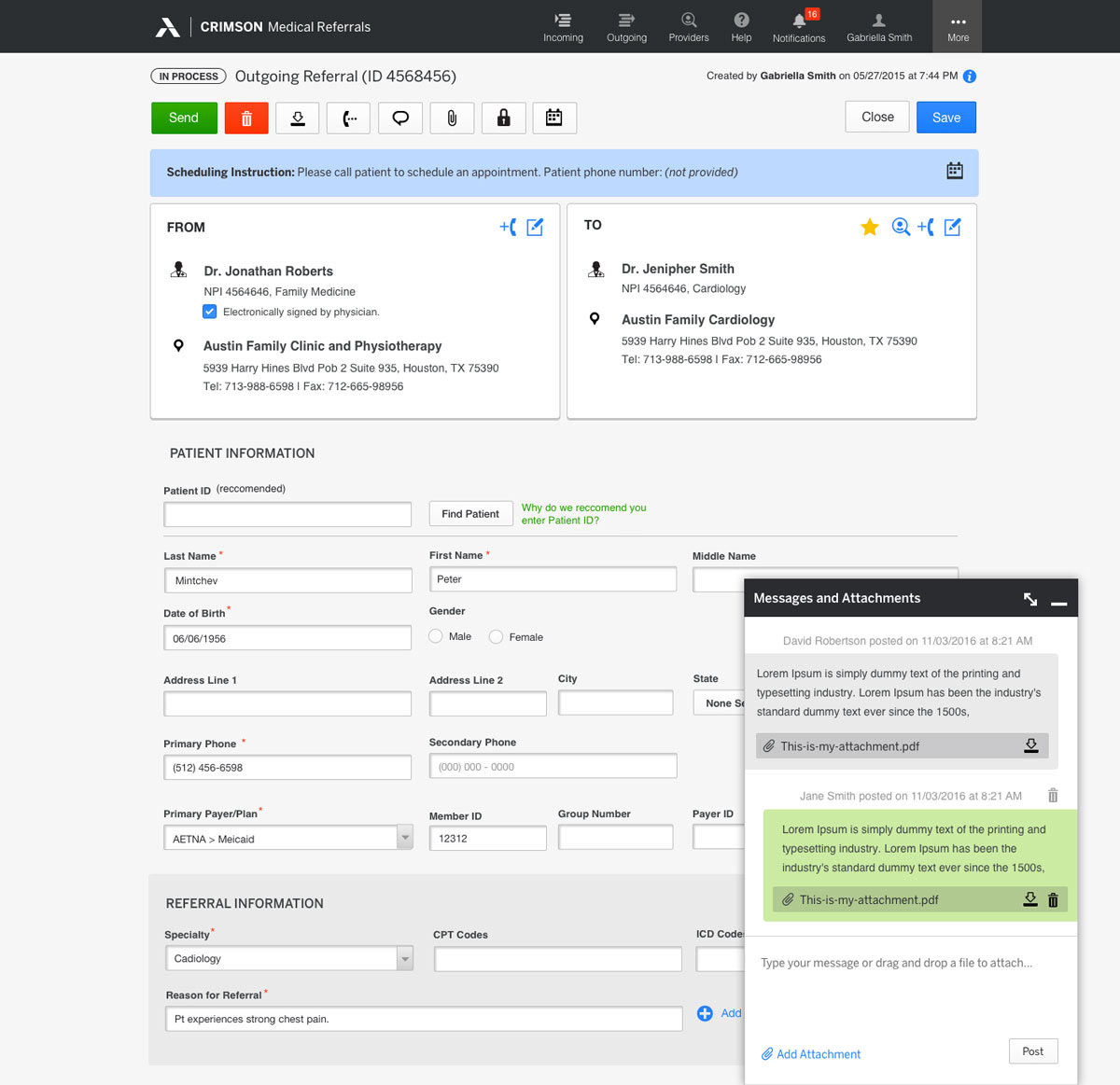
Optimizing the referral process - Processing and completing a patient transition can be a complex multi-stage process. The Referral Form is at the center of this interaction. After an initial design that had several usability problems, I became dedicated to designing, prototyping and testing a new design that successfully meets a combination of complex usability, workflow, and technical demands. The final design was successfully tested to increase speed of completion, reduce user errors, and greatly decrease training need.
Evolving Team Relationships and Roles
From the start of the project our team worked at a startup pace. We were working on the first workflow product of the company and we had a steep learning curve ahead of us. We continuously worked on finding ways to improve cross-team communication and collaboration in order to improve the efficiency and quality of our work. My discovery process, user research, and deliverables evolved to build empathy with the user and inspire product ownership across the entire team.